Case Study: Tracker Charts
A complete rewrite of a mood tracking application, with expanded features for granular data exploration and recording.
Background:
I joined myStrength at a time when they were planning a major overhaul of their existing web application. They had made the decision to completely rebuild their entire application from the ground up; both front-end and server-side architecture would be all new. The existing application had lots of functionality that would have to be rebuilt and improved upon while remaining somewhat familiar so as to not ostracize existing users.
Of the many features we worked on, one of the more important and difficult to get right features was the Mood Tracker. The Mood Tracker, in its original conception, allowed users to track their Depression and Anxiety levels over time. The collected data were displayed together on a single line chart, with little data "tares" to represent gaps in data. It did a fine job at comparing these two metrics on a given day, but it left much to be desired for.
For the redesign of the Tracker Chart, we had to hit a balance of maintaining some form of feature parity with the existing chart and expanding the feature set to meet the new set of specifications.
The initial constraints to be carried over were:
- Users must be able to chart their "Depression" and "Anxiety" levels together, so they can see how they compare with each other.
- The chart must show trends over time.
With the new architecture, we were able to improve and expand upon the initial feature set, and we added the following constraints:
- Must be able to chart additional "Trackers" (~12 were identified)
- New design needs to be fully responsive, from 320px-wide phones to desktop screens
- Must work well for users with many years of data, as well as users who have only been using the tool for a few days or weeks.
First Iteration
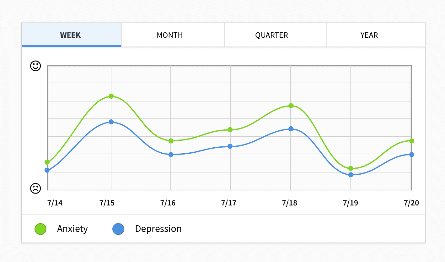
We started with a fairly standard chart design. A simple evolution of the original chart that was used for displaying "Depression" and "Anxiety", with added tabs for changing the time scale between "week", "month", "quarter", and "year". This iteration accomplished the goals described above, but it started to fall apart as we added additional Mood Trackers. For the user looking for a familiar experience, this was a clear upgrade, but it failed users looking to expand their usage of the tool.
Second Iteration
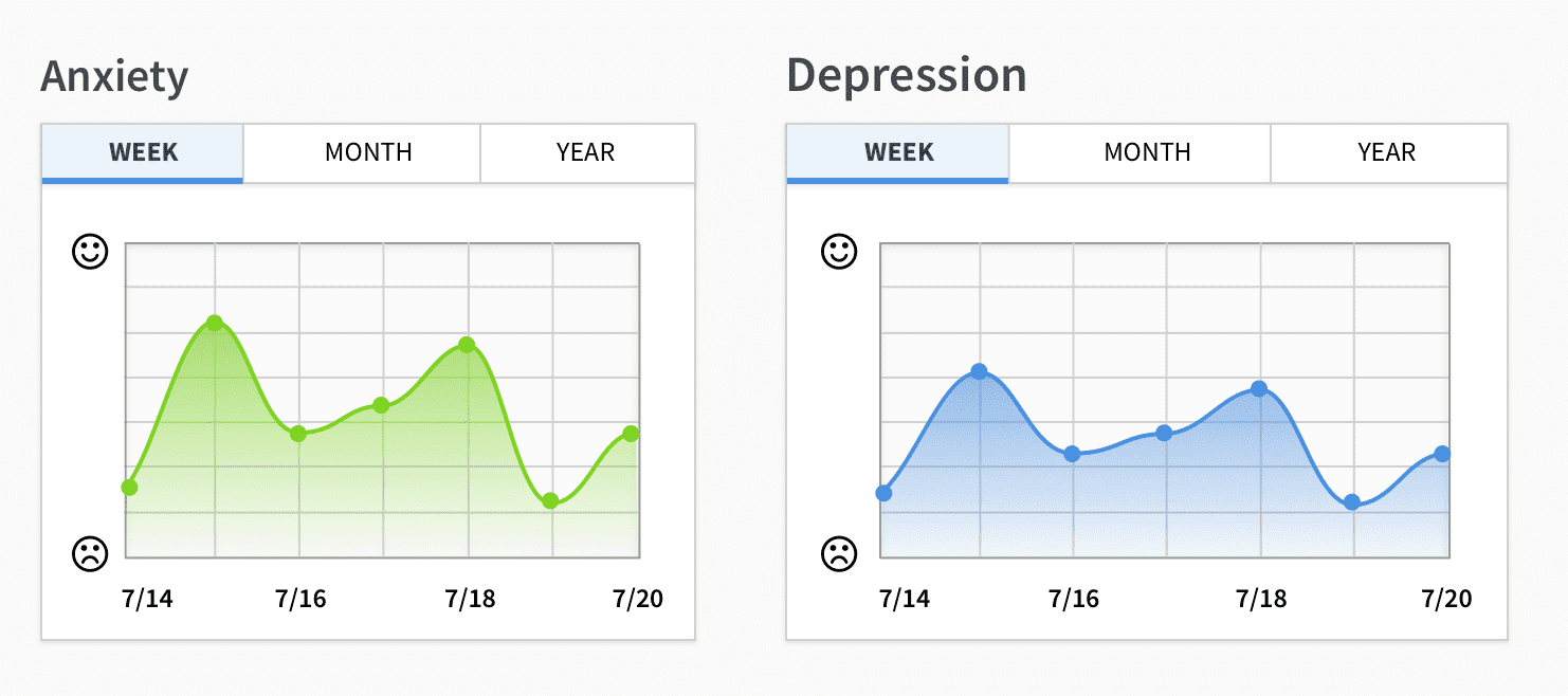
In this phase, we tried something entirely different. While we wanted to keep things similar for existing users, it was clear at this point that the old layout was simply not going to cut it. The more Mood Trackers a user added (in other words, the more time they invested in the tool), the more difficult the chart became to read.
Instead, we proposed a design that involved breaking the single chart up into many. Each Mood Tracker was placed on its own chart, with its own set of timescale controls. On smaller screens, the charts could fill the full width of the viewport allowing the user to scroll to see the rest, while on larger screens would lay the charts out in a grid. While we lost the ability to see and compare multiple trackers directly, what we gained in legibility made this iteration more successful than the first.
Breaking away from the original chart design opened the creative floodgates and we explored more options. After taking feedback from other stakeholders with interests in the chart, we released a version to get user feedback on. We collected the data from active users and replaced it with a simpler, more colorful option.
Taking a Breather
After launching the full redesign of the application, we were able to circle back around and clean up the areas that we were less happy with. After hearing users' thoughts on the new design, we took the parts that worked well and removed the parts that did not. We were also able to rework some of our legacy data APIs to fit better with the new front-end architecture, making it easier and more efficient to view different levels of detail in the data.
Dealing with Real-Life Data
As is true with most things in life, production is never the same as development. While taking a break from developing new features, we took a deeper look at how our typical users were using the Mood Tracker tool. What we found wasn't entirely surprising, but it did highlight some user patterns that even the original chart failed to address adequately.
Our research found that it wasn't uncommon for users to skip recording their mood entries for several days in a row, leaving long gaps in their data. Sometimes a user would go many weeks without logging in, or they might log several entries in one day. The large variance in data sparsity made some of our real-user charts difficult to read, especially on smaller screens where data points would be forced to overlap.
Accessibility Concerns
Around this time, we also began to take accessibility more seriously within our product. We wanted to ensure that any user, no matter how they use the web, should be able to use and benefit from the tools we create. I get into web accessibility in further detail in other writings, and if this is an interest of yours, I suggest you check out my list of Web Accessibility Resources for more info.
The Javascript charting library we were using made it difficult to make any visualizations accessible by users who rely on screen-readers or alternate input devices. This library used a Canvas context to draw the charts, which is essentially no different than using a regular image element when it comes to screen readers. Other libraries exist that offer SVG rendering, which can be made accessible, but that is often a lot of additional work that makes the SVG difficult to maintain (especially when dealing with dynamic data). We managed to land on a solution using good 'ol HTML definition lists, ARIA labels, and simple CSS.
Third Iteration
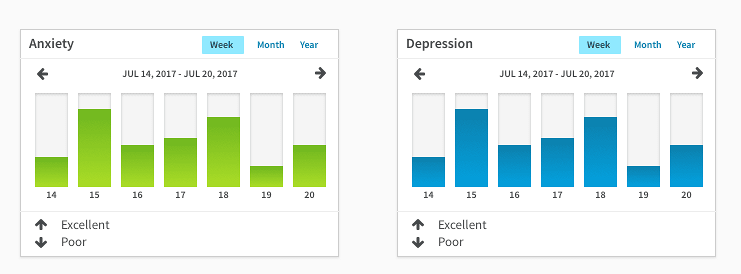
Each chart is a definition list, where the date is the definition term, and the bar is the definition description. Screen-readers know how to read these elements, and screen-reader users typically know how to navigate a definition list to find the information they are looking for. Using HTML also allowed us to make these charts keyboard accessible, so users can dig into more detailed data on a given day using whatever input device they choose.
Conclusion
When working with user-entered data which could be sparse on some days and dense on others, a bar chart seems to be the best approach. A line-chart works well when data sampling is mostly uniform, but that scenario isn't commonly found outside of automated systems.